

Launching My New Brand: A Modern Take on Old Cinema
This has been a long time coming, but I am so excited to officially launch my new site + brand. Here I’ll explain a little bit about why I am doing this transition.
As a lifestyle photographer, my work is all about capturing the beauty in everyday moments, creating images that tell stories and evoke emotions. Recently, I've taken a significant step in my journey by launching a new brand, complete with vibrant, sophisticated logos inspired by a modern take on old cinema. This fresh visual identity reflects my evolution as a photographer and my passion for blending timeless elegance with contemporary flair. Here’s a look at the inspiration behind my new branding and how it came to life.
I’ve been a photographer for 17 years. I first started as only a wedding photographer. Once my brides started having families, I opened my business to family photography. For a few years, I’ve been doing more and more commercial work, and as much as I tried to fit that into the box of Quaint+Whim. It is just a completely different market, so after many long talks and contemplations, I’ve decided to bring my commercial work under my name, TahJah Harmony, and keep my brides and babies under Quaint+Whim.
As a business owner I have a fond passion for businesses and helping them learn to leverage their brand and marketing through photography. I’ve noticed that I would have clients invest in photos, but then not know what to do with the images afterwards. I’ve realized that I have a unique perspective on guiding clients towards photography that best shares their story to connect with their ideal clients.
When it comes to my business, I’ve always done everything myself. My site, branding, graphics, headshots, and marketing, I’ve never invested in someone else sharing my vision. I knew that I wanted TahJah Harmony to have a very different brand style from Quaint+Whim, but every time I tried to do something it just looked very Q+W. So I worked with Third Ginger Studio, and she created the most perfect brand for me. Here are some elements I love.

My primary logo in my brand colors. I love how it is whimsical and balanced.
The Inspiration: Modern Cinema Meets Timeless Elegance
A Love for Old Cinema
Old cinema has always held a special place in my heart. The classic films, with their rich storytelling, dramatic lighting, and iconic aesthetics, have been a source of inspiration for my photography. I wanted my new brand to capture the magic and sophistication of this golden era while incorporating a modern twist that speaks to today’s audience.

My secondary logo! I love this one so much the J and the O are very chef kiss!
The Design Process
Collaborating with a Designer
To bring my vision to life, I collaborated with a talented graphic designer Third Ginger Studio. She is Australian, and I’ve always loved how she incorporated color into her designs and her behind the scene IG Stories. We started by brainstorming ideas and discussing the elements of old cinema that we wanted to incorporate, such as bold typography, classic film motifs, and a color palette that evokes a sense of sophistication and glamour. She took all my random streams of thoughts and created a brand I am SO proud of.
Choosing the Color Palette
Color plays a crucial role in setting the tone for a brand. We selected a palette that includes rich, vibrant hues reminiscent of vintage film posters and Technicolor movies, but also these colors seem like a very elevated Mardi Gras palette, and being a lady from Louisiana I don’t hate it.
Designing the Logo
The logo is the centerpiece of the new brand. We opted for a design that combines classic film elements with a contemporary twist. The typography is bold and elegant, inspired by vintage movie titles, and Broadway theatre posters. The icons, have a bit of a cinematic approach, but also I wanted an icon that looks like it could be on the side of a high end brand like Prada (My dream brand to photograph for!) and a moth design that is inspired by PHOTOTROPISM: a biological word that is used for plants and organisms (like moths) that gravitate and move towards the light. The result is a logo that feels timeless yet modern, perfectly capturing the essence of my brand.

Icon TH graphic I can use for watermarks
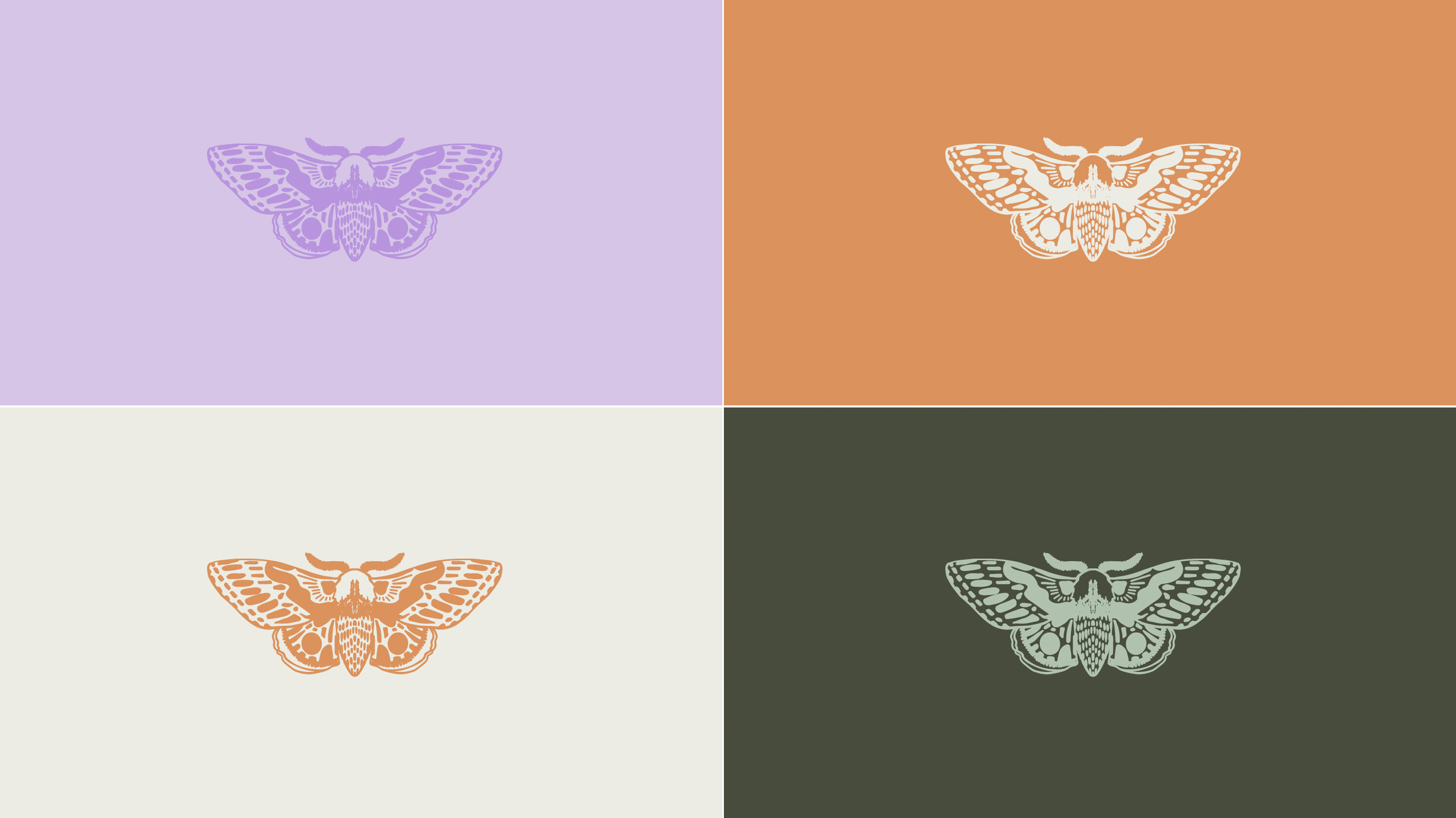
Moth motifs I can use for patterns and other creative elements
Personal Reflection
Rebranding has been a transformative experience for me, allowing me to reconnect with my passion for cinema and storytelling. It’s not just about a new logo or color scheme—it’s about expressing who I am as a photographer and the unique perspective I bring to my work. I’m excited to continue this journey and see where this new brand takes me.
Conclusion
Launching a new brand inspired by a modern take on old cinema has been a labor of love, blending my passion for photography with my appreciation for timeless elegance. The vibrant, sophisticated logos and cohesive visual identity reflect my commitment to capturing the beauty in everyday moments and telling stories that resonate with my audience. As I move forward, I look forward to creating even more stunning images and sharing my unique vision with the world.
So let me introduce myself
Hiya I’m TahJah Harmony! Ready to see the world through a lens that combines classic charm with modern flair? Let’s create beautiful, timeless images together. Contact me to book a session and experience the magic of my new brand.